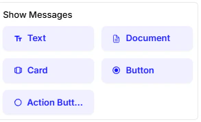
The Show Messages cards are for the chatbot’s output what the user sees and receives. These cards let you present information in various formats to make the conversation more engaging and informative.Documentation Index
Fetch the complete documentation index at: https://docs.chatzy.ai/llms.txt
Use this file to discover all available pages before exploring further.
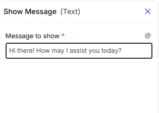
Text
This is the most basic way to send a message. You simply add a block of text for the chatbot to display.- Message to show: Enter the text you want the chatbot to send to the user.
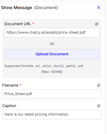
Document
This card allows the chatbot to send a document to the user.- Document URL: The web address of the document you want to send. You can also upload a document directly.
- Filename: The name the document will have when the user downloads it.
- Caption: A short message to display alongside the document.
Card
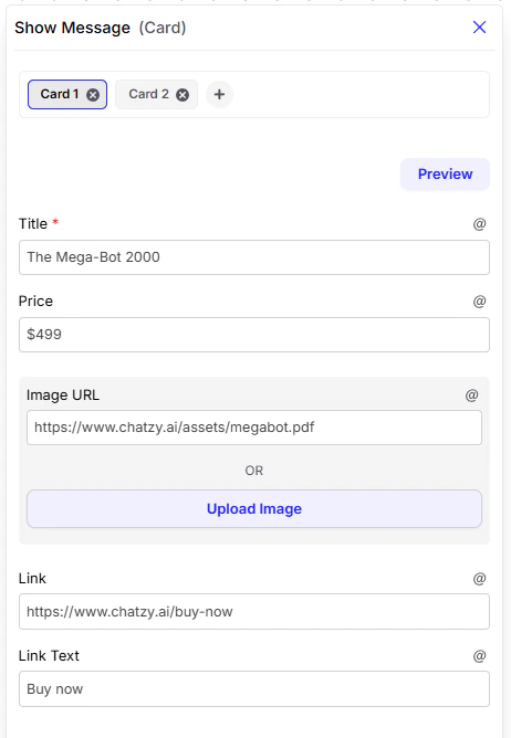
This card is used to display rich, structured information such as a product, service, or profile.- Title: The main heading (e.g., product name, service name, or profile title).
- Price: An extra text field that can be used flexibly. Since it doesn’t have a fixed format, you can use it not only for prices but also as a subtitle (e.g., a short description, role, or category).
- Image URL: The web address of an image, or you can upload one directly.
- Link: A clickable URL for more details.
- Link Text: The button text for the link (e.g., “Learn More”, “Buy Now”).
Example 1:
- Title:
The Mega-Bot 2000- Price:
$499- Image URL:
https://www.chatzy.ai/assets/megabot.pdf- Link:
https://www.chatzy.ai/buy-now- Link Text:
Buy Now
Example 2:
- Title: iPhone 15 Pro
- Price (used as subtitle): 256GB – Titanium Gray
- Image: Product image of the phone
- Link: https://apple.com/iphone-15-pro
- Link Text: Buy Now
Button
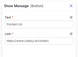
This card creates a clickable button, useful for directing the user to a specific external webpage.- Text: The label that appears on the button (e.g., “Visit Website”).
- Link: The destination URL where the button directs the user.
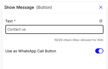
- Use as WhatsApp Call Button: Enabling this option displays a “Call Now” button, allowing the user to call your WhatsApp number directly from the chat. (Note: This is a WhatsApp-exclusive feature).
- Note: When this is enabled, the content in the Text field serves as the message body displayed to the user alongside the call button.
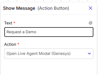
Action Button
Similar to a regular button, this card creates a clickable button. However, instead of linking to an external webpage, it triggers an action within your chat flow, allowing you to advance the conversation based on the user’s choice.- Text: The text that appears on the button.
- Triggered Action: Defines which Live agent Modal in the conversation should start when clicked.